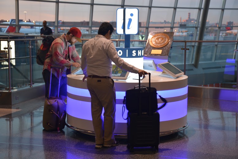
Infobar personalizes interactive digital wayfinding at Boston Logan International Airport
 Art of Context and our client Massport are pleased to announce the arrival of Infobar in Terminal A at Boston Logan Airport(BOS). The latest iteration in passenger information and interactive digital wayfiniding, Infobar combines advanced technology with an eye-catching, user-friendly and easy to maintain enclosure. Using HTML5, and AOC’s Directory Management Studio Infobar provide travelers with up-to-date information and through the use of QR codes and SMS offers passengers to opportunity to take their wayfinding with them on any mobile device. For more than five years, Art of Context has worked with BOS, to develop innovative, passenger focused digital signage. Last year AOC and BOS rolled out large interactives in Terminals B and C. While well received and attention getting, observation and data suggested that passengers liked the large form factor for viewing the map, but were reluctant to interact with such a big interface. For the Infobar project, our goal was to create a more inviting information delivery system, one that took advantage of the latest technical advances while remaining easy to use and maintain. Infobar innovates and excels in many areas.
Enclosure – We had a perfect location, and knew we’d need an innovative and unique enclosure for Infobar, the team worked with Design Communications Limited to create an eye-catching, accessible enclosure that complimented the designated space. The team engaged Design Communications Ltd (DCL). a leading Boston, custom signage manufacturer. The result was an accessible form factor and a welcoming enclosure that says “I can help” instead of “I perform transactions”.
Hardware maintenance – Things break. After the ribbon is cut many systems fall down by being difficult to maintain. How often have we seen a blank screen in a public space? Aesthetically we wanted to avoid access panels so DCL designed a circular enclosure with a top that easily raises to allow access to the electronics stored inside. The whole package is enhanced by a LED-lit light ring to attract travelers.
Interface and usability – Here’s where the system really stands out. Our Solutions Architect, a consummate student of technology, led the charge to utilize HTML5 and a Chrome box along with SVG to create a fully interactive map that users can pinch and zoom without losing clarity. Since SVG is pure data underneath every aspect of the map is programmable. This, in conjunction with tight integration of real-time flight data enables us to change the plane icons at the gate to match the color of their status: green for on time, yellow for a change and red for delayed. Nothing kills utility faster than outdated content. Infobar, utilizes AOC’s Directory Management Studio to make keeping content fresh a snap.
Results – Happy Passengers! Infobar launched on October 16, 2015 and passengers were immediately drawn to it. Murmurs of “wow” and cries of “that’s awesome” abounded. Data and anecdotal feedback has positive, but the numbers tell the story. Infobar is receiving four times the traffic of nearby large-scale interactive digital signs. User engagement is also up with users spending twice the time at Infobar screens than they spend at larger screens. We are also seeing deeper engagement since users can transfer flight data to their mobile device via QR code or SMS.
The launch of Infobar in Terminal A marks the beginning of an all-campus consolidated wayfinding system for Boston Logan. Future deployments will be made at regular intervals in the next 12 -18 months.


